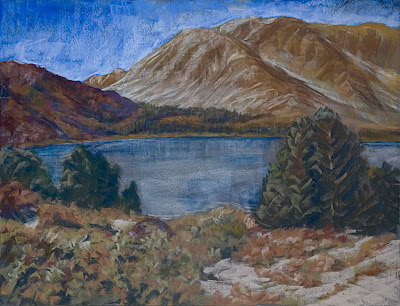
The first dusting of snow at Virginia Lake in early October was a chance to paint the Sierras in a different light. While foregrounds have been such a struggle, this one is loose and simple with shapes instead of over-worked rendering. This painting really wasn't "finished" when I took this picture of it.
The trees on the right are a bit funky, but the snow and bushes are good. I even like the small trees on the left.
But then there's the colors of the mountains. Sometimes I wonder what the hell I'm doing. I get the light and dark part but the color harmony here is more like a dissonant symphony.
Purple, damn purple. That's the color you see . . . but you don't see. Maybe purple isn't really purple. Guys like Albert Handell and Lorenzo Chavez are purple maestros. Their plein air palettes are filled with every value and hue of purple. My mountains look like they're behind Calico Ghost Town in the desert. I know I didn't see those colors, I just made them up.
"What's wrong with that?" you might ask . . . my subconscious does. I can only answer that it's not harmonious. I'm getting out my Stephanie Birdsall limited palette of 12 Holbeins and I'm gonna take another whack at it.
20 November 2007
19 November 2007
A Big Victory
Stay loose is Cathy's mantra for me. About a year ago I lugged my oils up to this vista overlooking the Channel Islands. Crazy Brad was out there dancing at his easel banging out another 24x36 masterpiece en plein air. I'm watching him flabbergasted as he isolates the essence of the scene and paints with real motion and E-motion.
I put the damn oils back in the car. Out came the sticks . . . but a very limited palette. Shit, Dave, just paint what you feel. Just paint for yourself. No one's gonna see it anyway except you . . . and Brad. If it's truly crap he'll let me know straight away.
"Damn," he said, "that's your best plein air painting EVER!" I had only been painting for about an hour. "Stop now."
I did as I was told. Was I ever proud . . . . 8x12 was big enough for the day.
One thing I always loved about Brad's work is the fact that it isn't over-worked. He usually leaves a lot of paper visible. So I figured I'd give it a whirl. Just laid down a layer or two . . . and actually left the brown-toned paper to breath through. And so, holy cow . . . he inspired me into doing something which isn't over-worked. This was a victory . . . a big one.
It's Afternoon . . . I hope!
A summer afternoon outside Ojai, California and I found the oaks I was looking for. This scene was going to be a lesson for me. I didn't know when I would get to it. It went into the massive photo file waiting for me to be ready,
Crazy Brad, Crazy Brad . . . . his voice rings in my head while I paint. I never had a professional artist as a friend and teacher. He has a unique way of seeing the world and translating that vision to 2 dimensions. He has always kicked me in the ass, especially when I thought I did something well.
"Paint it again," he would say. "Do another, right now."
But the phrase which has stuck with me for a long time is "What time is it in your painting, Dave?"
OK, well, that really got me going. I realized I was rendering realistic scenes, but . . . hmmm . . . no shadows. No "light" perspective was ever present. As October mad science gave way to November, a new era was unfolding in my landscapes. Shadows . . . shadows . . . . Brad's words echoing loudest in the initial block-in.
And, oh yeah, Brad was also the guy who told me my paintings looked like a series of flat planes. No unity, no real perspective.
There is another voice in the perspective battle. Lorenzo Chavez is a Colorado painter who taught me more about aerial perspective than I could have ever imagined. Quiet and humble, Lorenzo laid out the basics, but essentially, he taught me to truly see. I was always a good "looker" but I couldn't translate to a painting what I thought I saw. Warm to cool, dark to light.
Rules, yes . . . . concepts to be learned.
City Abstract 2
Well I took another whack at an abstract urban scene and funnily enough it ended up much like the first try. I think I did more with color although I used the same 4 Dr Ph Martin watercolors.
However, now that I look back at number 1, I see that this one has much more drama and depth.
Maybe this will be a series. They (whoever they are) say that every artist needs to do a series. I guess each one is a lesson
17 November 2007
Self Portrait
Mad Science 3
But Cityscape was, ostensibly, not where I wanted to go. I was trying to be abstract . . . but literalism was rearing it's ugly head.
It was all heading somewhere, but I wasn't totally free. The first one was the purest. It was time to take a stand creatively.
A funny thing happened then. I yanked out that gessoed covered credit card and painted the mountains above Lone Pine from memory. The whole painting took 15 minutes. I wasn't "thinking" while it was happening.
Making the large shapes was liberating. Doing the mountains was fun. Importantly, there was no photo reference used. This image came from memory.
OK, now this out of the way . . . . I had to get loose again.
Mad Science 2
Then came the the vertical rectangles . . . almost a cityscape . . with the same materials. Again, good fun, but was I really getting free?
The problem, as it always seems to be, is my total commitment to actually "make" something. Why do I feel this need? Can't I just "waste" paper and paint and NOT make something. Does every effort have to be a finished product? Sometimes I want to sit myself down and have a discussion about this.
October Mad Science 1
Getting Abstract
Abstraction isn’t easy. What do you do? What are the shapes? What are the colors? Why are you covered in gesso and paint? Why is this necessary?
It’s necessary because I had to do it.
This first abstract (orange and green, above) was done in a crazy frenzy of black gesso, white gesso, an old credit card and a piece of plastic screen material. After it dried I pulled out some primaries from Dr Ph Martin Hydrus watercolors. I loved working on the 300lb paper. It now reminds me of an aerial view of downtown Denver.
Subscribe to:
Posts (Atom)
Fighting the Ugly Stage
It's the damndest thing . . . the ugly stage of a painting. After a careful drawing of the essential shapes followed by the setting up...
-
Stay loose is Cathy's mantra for me. About a year ago I lugged my oils up to this vista overlooking the Channel Islands. Crazy Brad was ...
-
As if I didn't have enough artistic pursuits to contend with . . . . . it's now on to watercolor. Figuring that I would arrive in Ch...